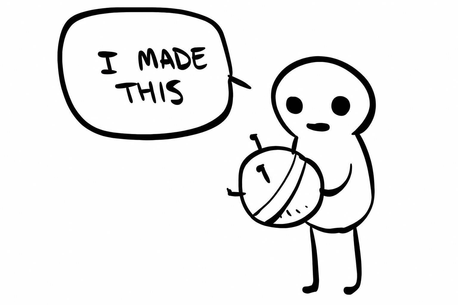
When you think of a vibe coded website, you probably think of something like this:
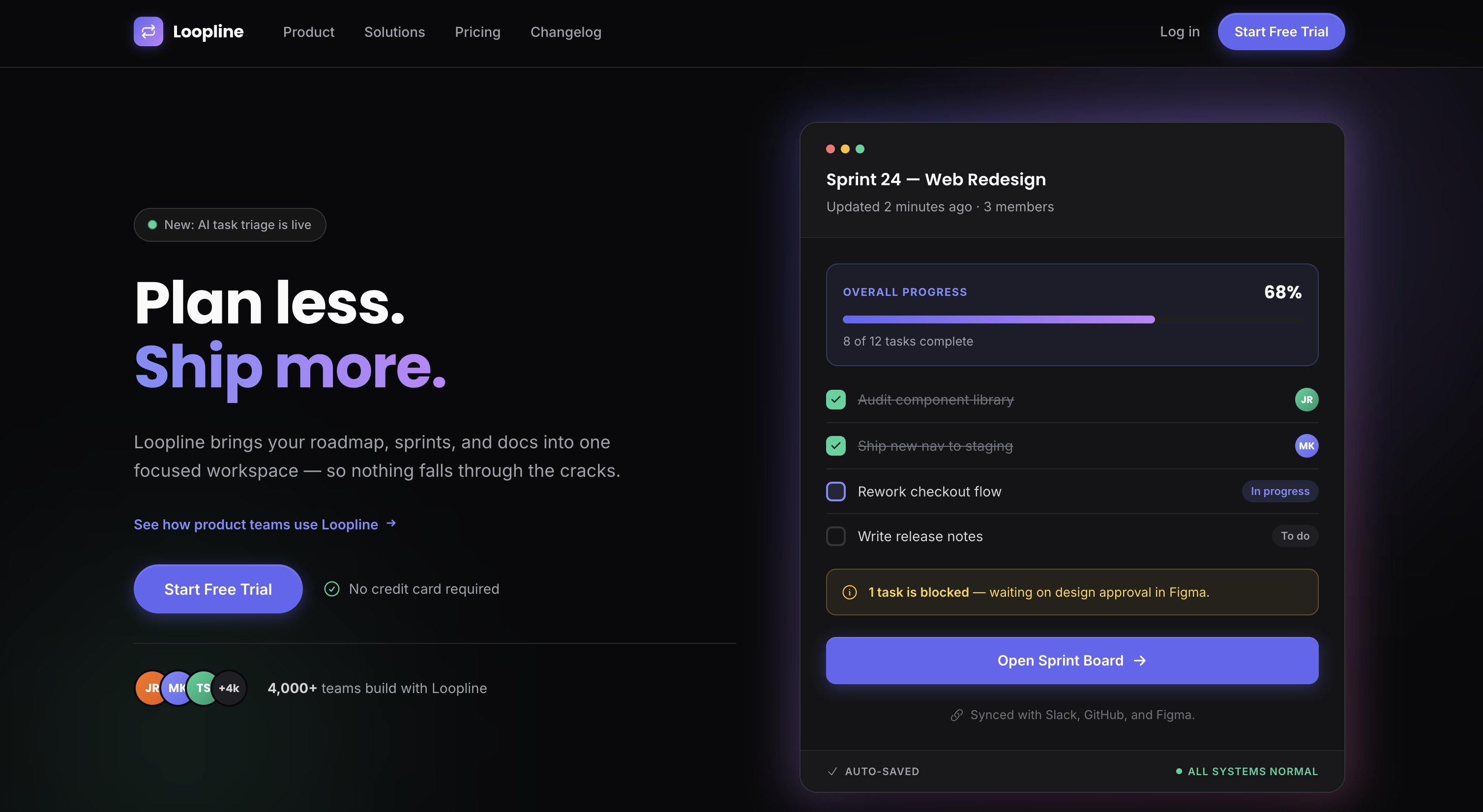
However, I also vibe coded my website, and it looks like this:
Now, I personally think it's a big stretch to say this looks a designer made it, but I actually got told this! A lot of people came up to me and asked me how I made the website, and even who I worked with on it.
So after being asked so many times about how it was done, I thought I'd take on the impossible task of talking through my creative process for building the Railcode website.
Not because I think I'm amazing or that designers are not necessary (quite the opposite), but because while most of the talk seems to be about LLM design slop, I've actually found myself more excited about design now that I have coding agents to help me. I was helpless before, but now I can actually make a creative vision I have a reality.
So my goal here is to show that you can leverage coding agents for tasteful design (tasteful meaning something you yourself like) and that you should feel empowered to do so.
A whole lotta rollercoasters
The name Railcode comes from the idea of "code on rails". Apps and agents in Railcode are just code, for which we handle the infra and guardrails (the rails) so they can be deployed fast in a safe environment.
Then, the week before I decided to make the website, I realized I was having a ton of fun building stuff for myself inside Railcode (I'm an active user) and when I asked customers about it, they said they were having fun too.
Rails + fun = rollercoaster, so I decided the website was going to have a rollercoaster on it.
Now, I'm not a designer, so it's really hard for me to create concepts from scratch. That means I have to rely on examples and inspiration. For this, I have two methods:
- Browse the web for designs that I like
- Tell an agent to generate a ton of designs of a thing in different styles
The idea here is to open my mind up to what might be possible. Most times I'll grab ideas from multiple places, combine them, and endlessly iterate on them until I get to something I'm happy with. Most times it's a dead end.
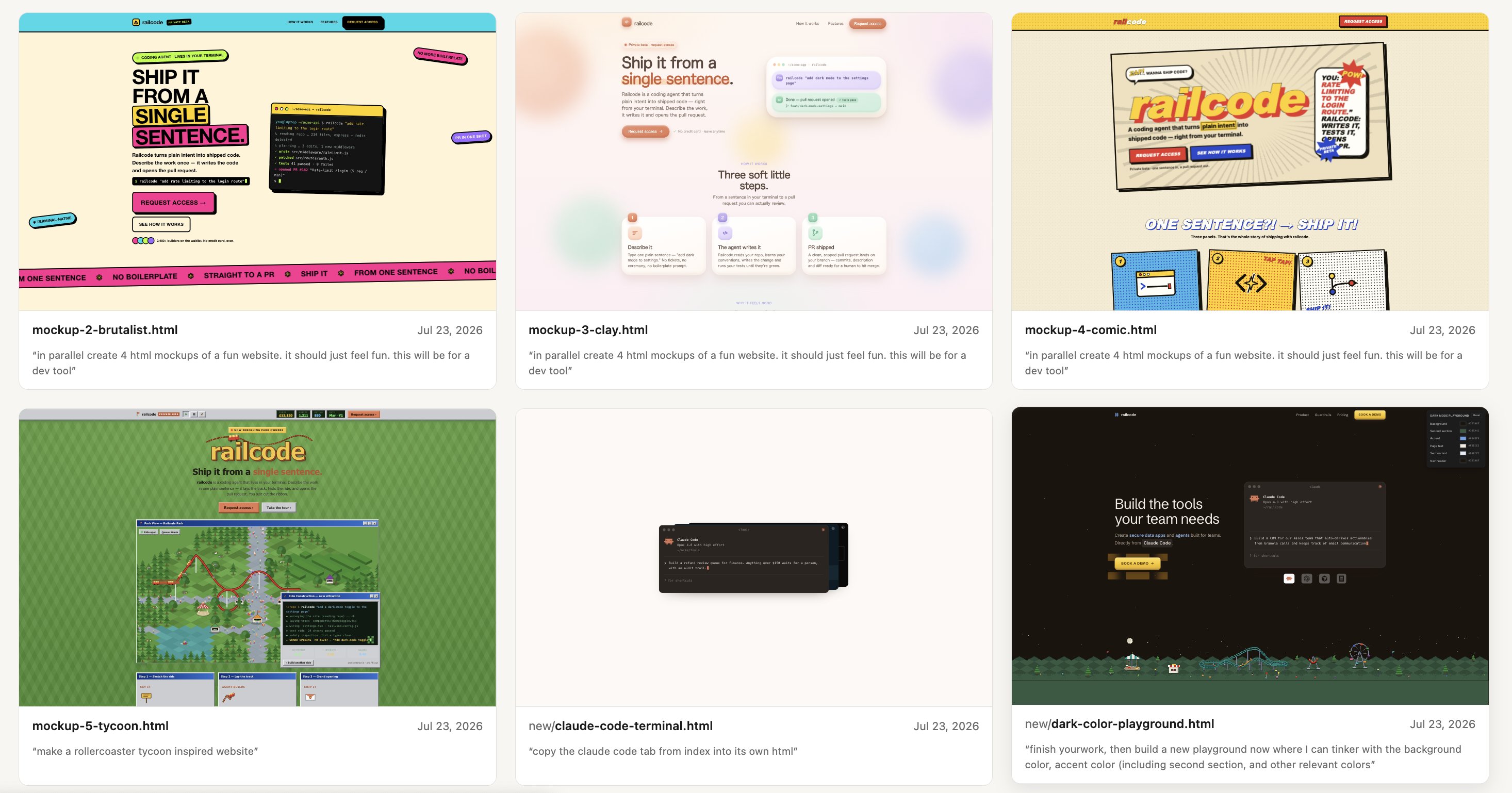
In this case, here's what the first rollercoaster designs looked like:
The ASCII designs (two top ones) were inspired by a friend's website that I'd seen earlier in the week. The other ones I left up to Fable's imagination. These were meant to serve as the seed for inspiration.
There are a few things at play here that help me:
- Levels of intensity: I'll tell the agent to take a concept/idea and generate designs that fall on different parts of the spectrum of intensity/complexity. This allows me to have a sense of if the concept as a whole is interesting (if I don't like anything on the spectrum probably I'm on the wrong spectrum), as well as gives me a sense if I think I want to be more minimalistic with a concept or if there's space to go for something crazier.
- Go wild: I usually ask an agent for at least 4 versions when trying out a concept, and sometimes even 10. I'll provide some level of guidance for at least half of the versions, and then tell the agent to go wild with the remaining ones. Most of the time these will absolutely suck, but they are useful in providing a spark for new ideas.
You can probably tell that the crazy ugly neon design was part of the "go wild" portion, and it's something I'd never use, but it took me away from the ASCII idea and into something more ambitious.
Rollercoaster Tycoon
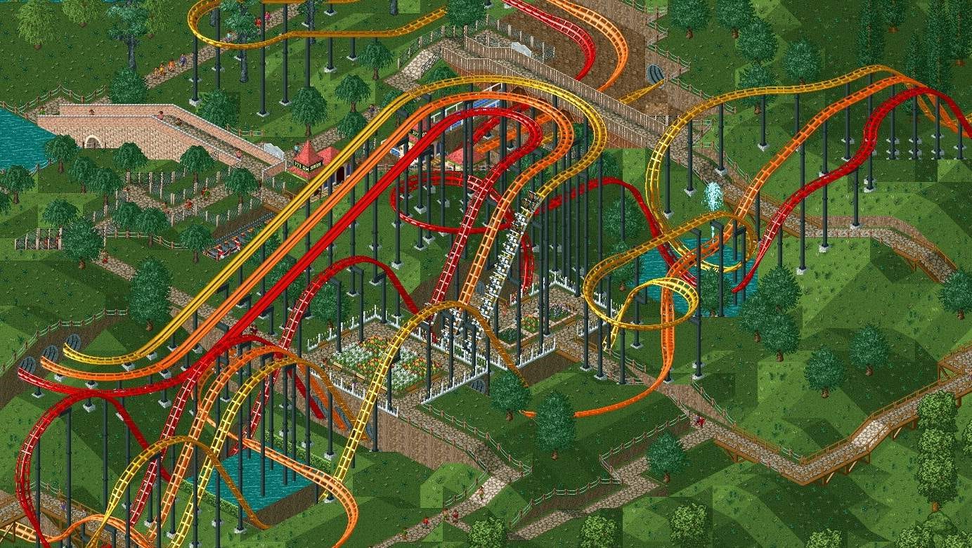
When I was a kid, I used to play this game called Rollercoaster Tycoon. The goal (for me at least) was to build the coolest possible amusement park. And as you see above, you could build parks that were really ✨aesthetic✨.
Looking at the Neon monstrosity that Claude created, I was reminded of this game, and that's when I knew I wanted my website to be a reference to it.
So for a start, I actually got Fable to build me a mini version of the game:
This was cool and for a second I thought my website would actually have a game in it, but after playing around with it for a bit I realized that it would have been a little too much.
So I went back to the drawing board and decided I was just going to get a single rollercoaster that I really liked. After enough attempts, I finally got it:
When I landed on this, I thought I was done. So much so that I just slapped the rollercoaster on a template and for a moment thought that'd be it.
This was cool and all but like wtf is a rollercoaster doing in the middle of this website? It was out of place.
Clearly, we needed a whole park.
Going off the rails
Having decided I needed a park, I felt for some reason it would need to go at the bottom of the hero. I'm pretty sure this comes from some websites I've seen before but couldn't remember any of them.
That led to the building of this strip:
You can start to see the vision take shape there, but put it on a website and it still looks pretty bad:
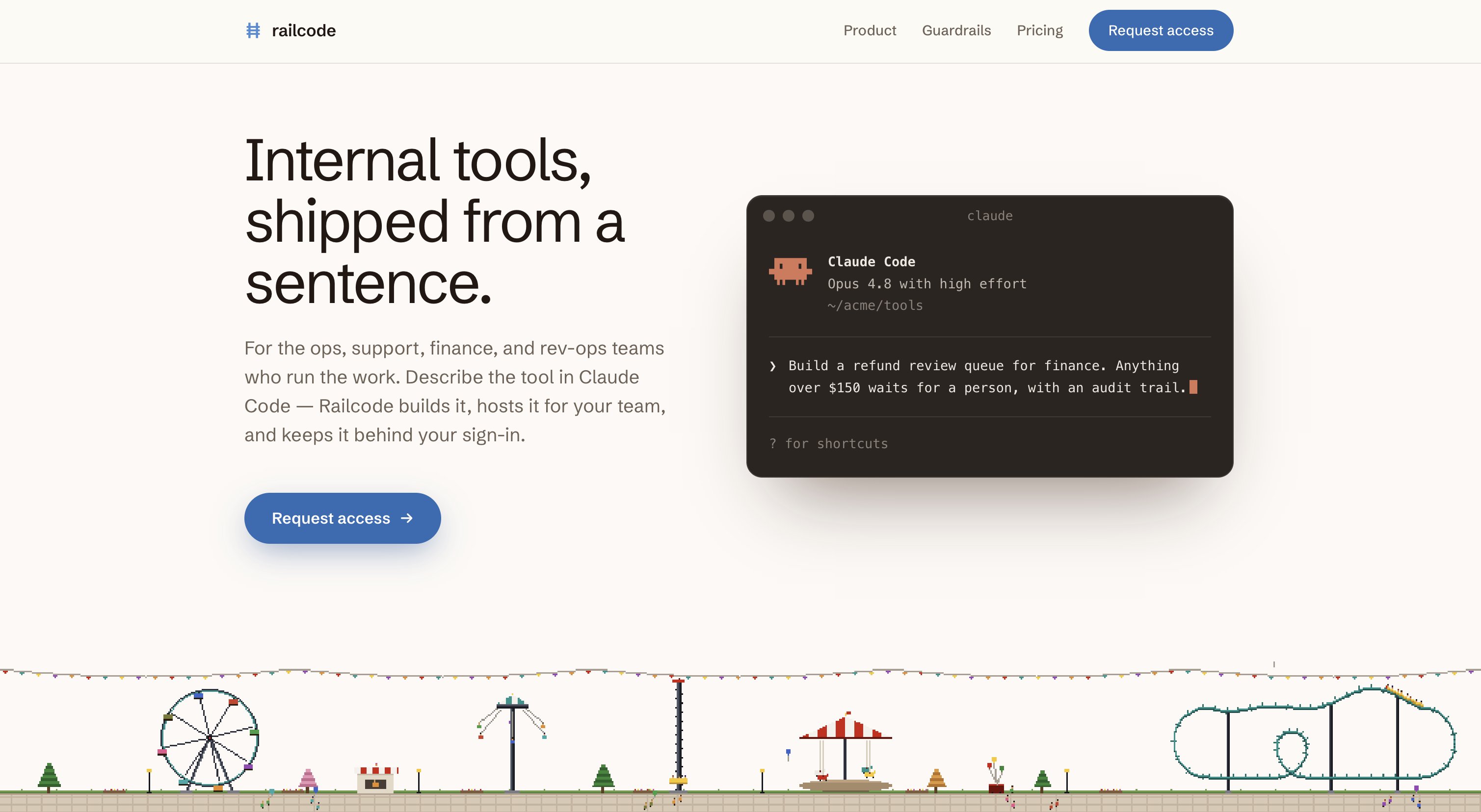
Iterate on that, though, and you get this:
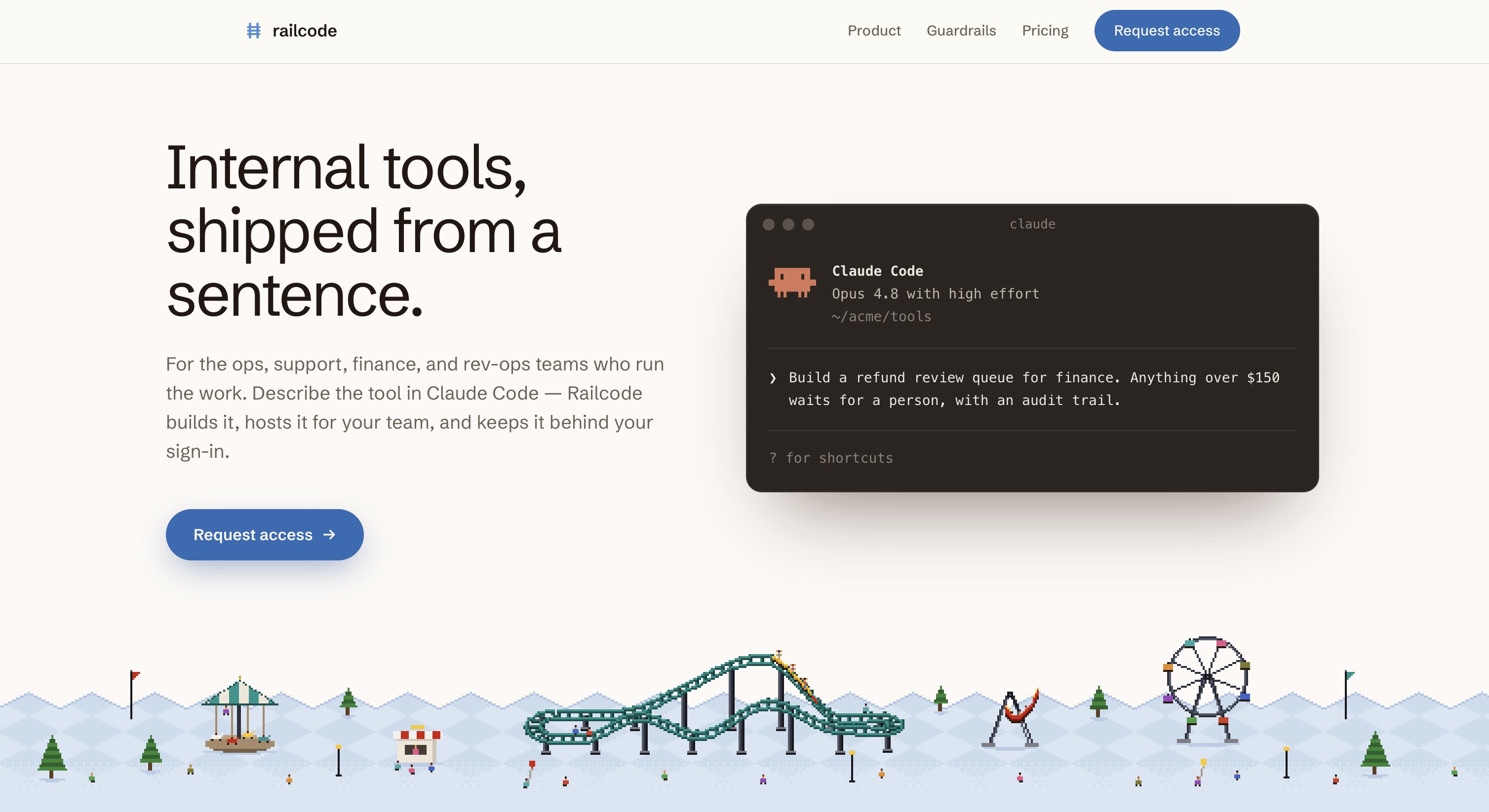
The way I got here was by anchoring the asset designs on the rollercoaster from earlier, hand-picking and working on the individual animations, and deciding that the strip shouldn't be standalone but actually a color transition to the next section. That last one I'm sure comes from some websites I've seen, but I couldn't remember any of them.
Forks on forks
When I landed on that last design I was extremely happy and even showed it to a friend right away. But something still felt off, which is when the forks came in.
When I build websites, I do one single HTML file until it's basically ready to go, and only then turn it into React with various components that can be edited by agents in parallel.
The reason for this is that it makes it really fast to fork/copy a design, change one or two things, and look at them side by side.
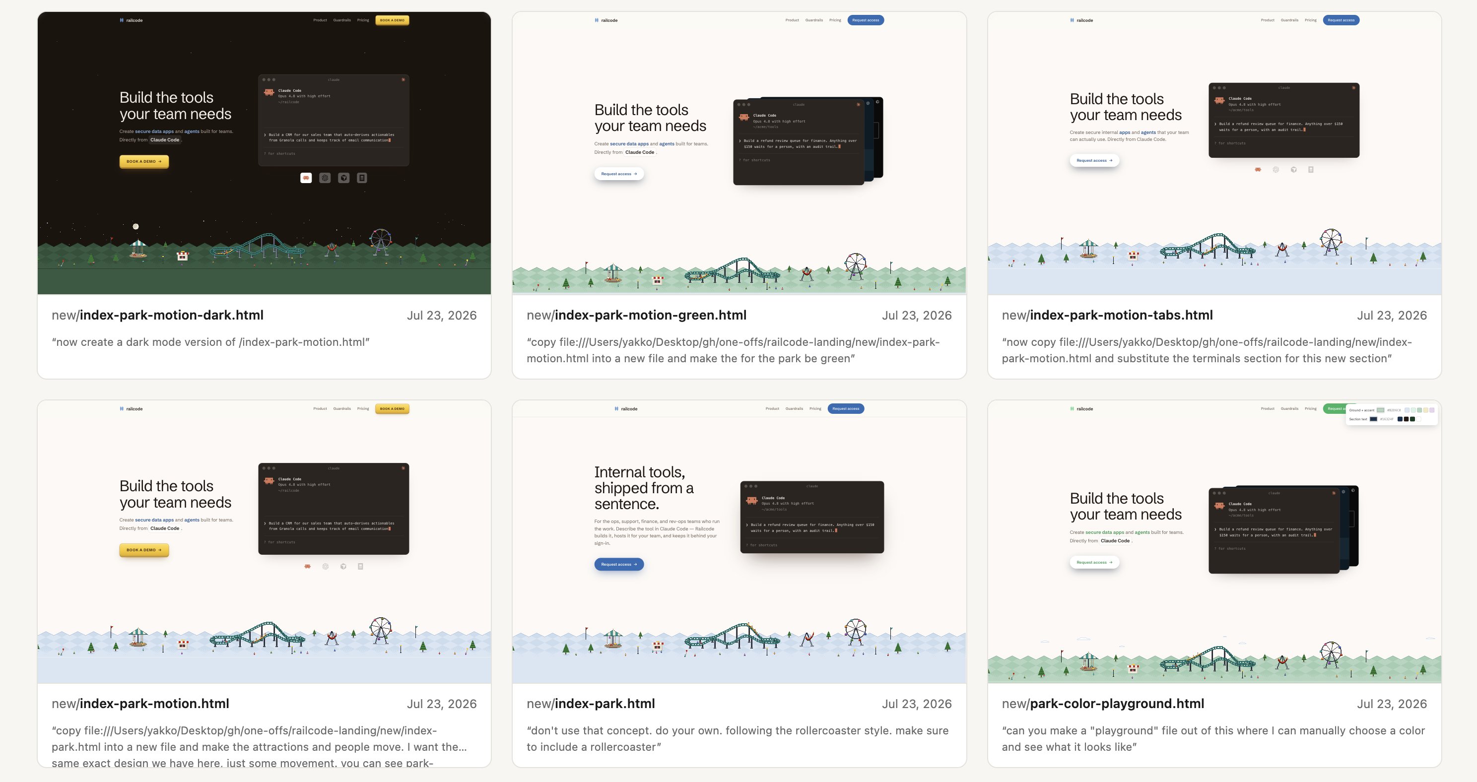
Another thing I do is build what I call "playgrounds" where I can play with colors and other variables.
In this case, I started by changing the grass color from blue to green (because grass is green, duh), but the green I got wasn't exactly what I wanted. So I got Claude to build one of these playgrounds where I could try different accent colors, text colors, grass colors, background colors, and so on, which is how I landed on the tone of grass that I wanted.
(I almost feel like building a little open source tool that helps with these forks and playgrounds. Maybe I'll give it a try when I have time.)
Then, with the grass done, I started obsessing over details.
Before even going on the rollercoaster direction, I kicked this whole process off by having Fable build me "mockups of a fun website for a dev tool". They were mostly all slop, but when thinking about a better design for the CTA, I remembered having seen something that would fit:
This is the argument for being exposed to a lot of designs early in the process, even if they're terrible. You might find a diamond in the rough later down the line.
Also, the white background didn't make the site feel fun (which is what I wanted), so I made it sky blue, then added in clouds for the vibes:
Everything else followed from there. The hero dictated the rest of the site.
The accent color of the Railcode product is currently blue, but the green on the website happened so naturally that I just embraced it instead of fighting back. That's how we got light green and dark green sections, and eventually the soil footer. I might need to revisit the product's design as a result...
The rest of the website still took a lot of iteration but once the style had generally fallen into place, I could reference it throughout when making new icons and assets. It was important to get the vibe down, because then I had a solid sense of direction.
But there are always more details to obsess over. The last example I'll give is the nav, which felt like it didn't belong as a static color, so I made it morph into the background color of whatever section is in view. Makes a huge difference in my opinion!
Inspiration
Like I said earlier, getting inspiration from existing work is essential for my creative process as a non-designer. And clear examples are also the best way to steer coding agents.
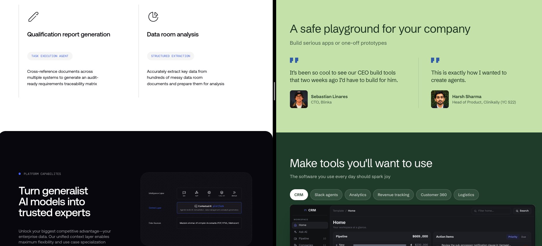
Sometimes you end up with a very similar representation of something you saw, like this light section turning dark that is a relatively common pattern but that I often refer to Contextual AI for:
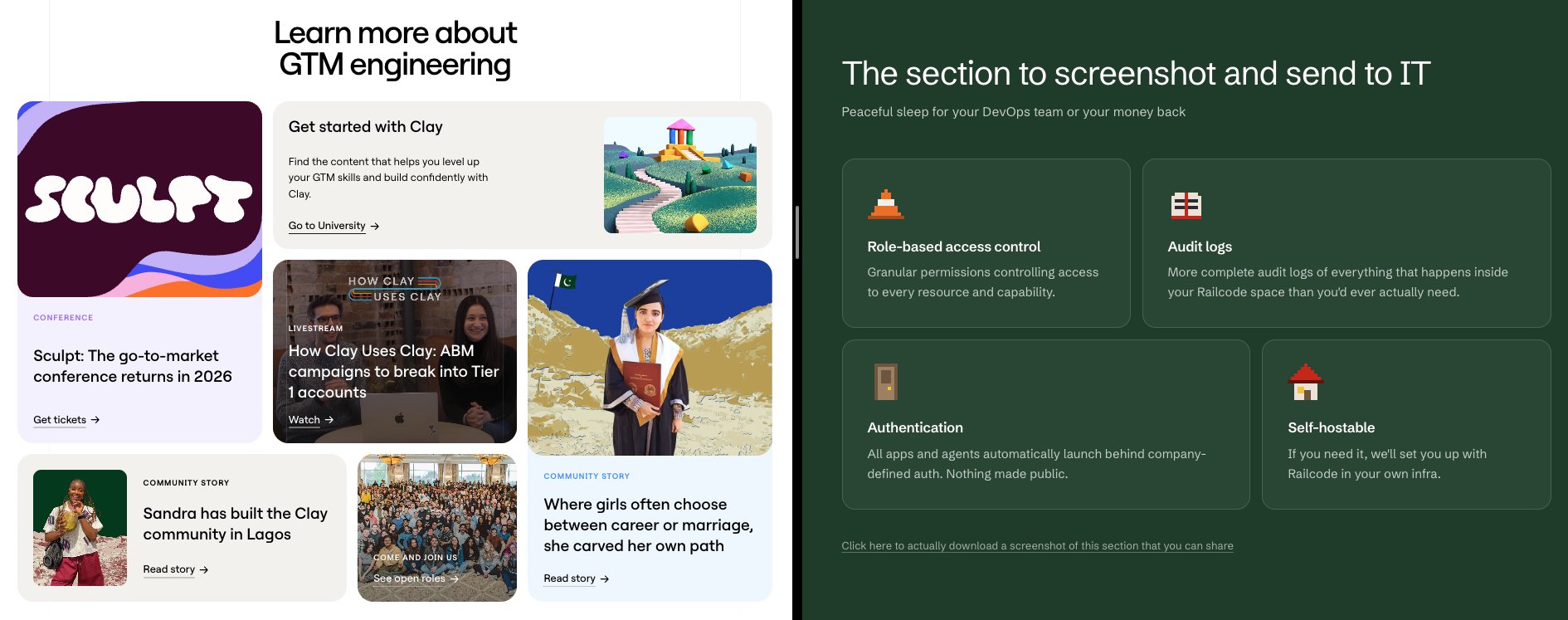
But other times things are less clear. Like this Railcode section that was actually inspired by Clay:
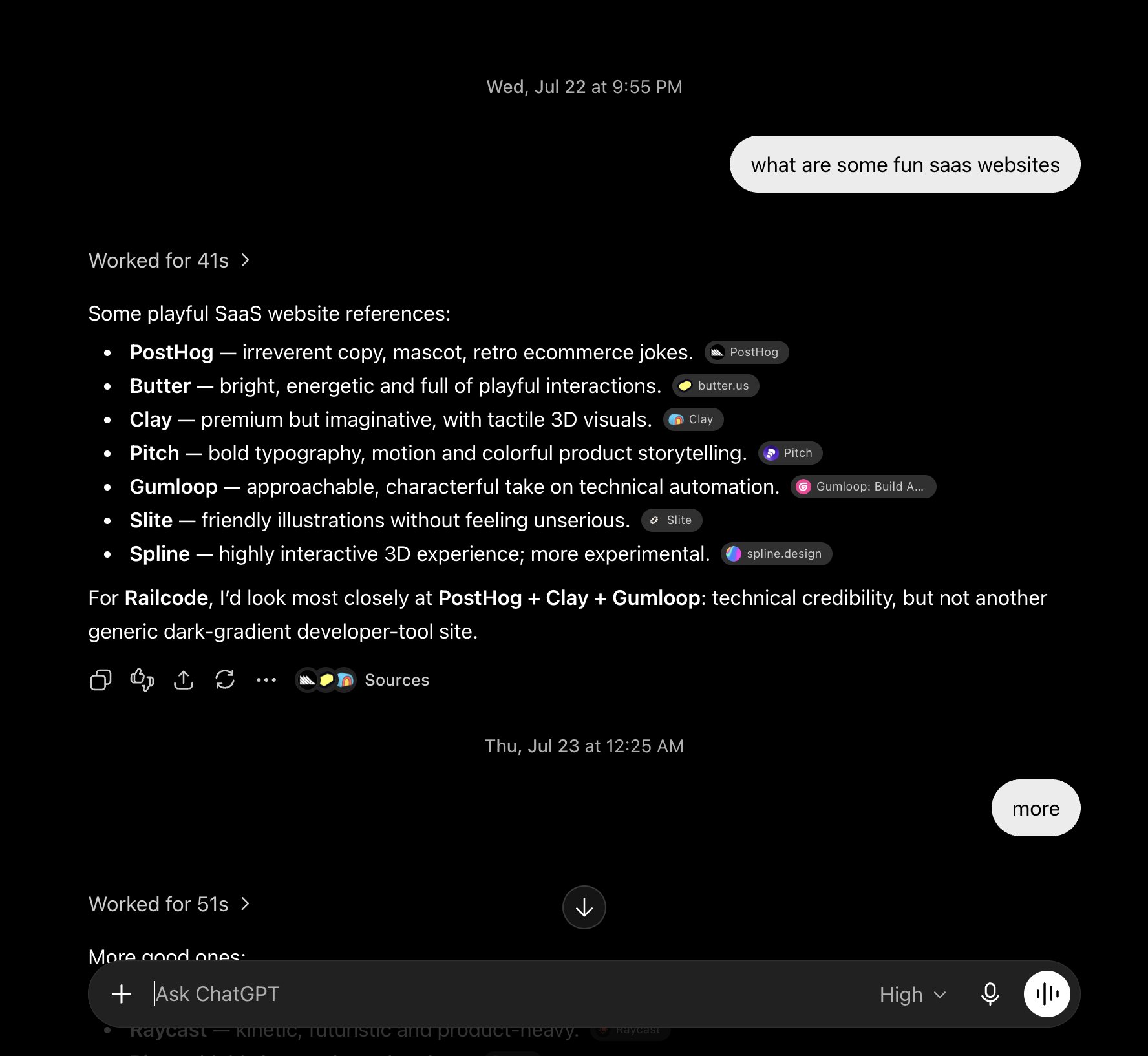
I was also constantly just taking in different websites, and even if I never ended up using something specific from them, they still had an impact. Railcode's website is nothing like Sentry's but I kept looking at their site to get a feel for illustrations that tie in well with content.
There's a lot more I could say, but I feel that this is already too long. So if I had to summarize what I think are the most relevant parts of my process, they are:
- I exclusively use Anthropic models for design. I've found that the OpenAI models really struggle even with specific directions. Fable is the best of the best.
- I keep everything in one HTML file until I'm satisfied with the design and ready to work on things like copy.
- I look at a lot of websites for inspiration. I regularly go back to websites I really like and constantly look for new ones. If I really like a specific component, I'll use it as the base for me to build on top of.
- I get Claude to generate tons of different websites at the start and end up throwing 99% of this work away, but will occasionally pull a component from one of them, or just get a new idea to try out.
- I often tell coding agents to "go wild" on a few designs, and also to take the seed of an idea and build multiple versions of it in a spectrum from minimal -> outlandish.
- I like having an easily accessible trace of my process, so I'll constantly "fork" a design, change a few things, and compare with the original. I might then continue working on top of the fork or go back to the original, but I never delete any of the forks.
- I build playgrounds where I can easily play around with colors, fonts, and placements and see the results in real time rather than go through the slow iteration process of telling an agent to change something.
- I iterate, and iterate, and iterate some more. Most iterations are dead ends.
And most importantly, I have fun in the process :)
Check out railcode.dev if you want to see the (un)finished product. There's a lot more I'd love to work on if I had more time but I'm happy with the result for now. Feedback welcome, especially from real designers.